
A character can stand in a blue street at midnight while their face remains perfectly readable. That does not automatically make the scene a failed imitation of darkness. Animation has to communicate an action as well as establish an hour, and colour is one way of balancing those tasks.
Start with what remains visible
Choose a short scene you know and watch it once without pausing. Which element attracts your eye first: a face, a doorway, a window or a moving hand? Then pause at a moment of action. Look for differences in lightness between the important shape and its surroundings. Two surfaces can both be blue while remaining distinct because one is much lighter.
Now imagine the frame in grey. Would the gesture still read? This is a useful viewing question, not a claim about the exact workflow used by that production. You cannot infer a studio’s technical process merely from a finished frame.
A warm light creates a local exception
A small amber window against a cool street can suggest warmth, attention or a destination. Notice whether the warm colour reaches the character or remains separated from them. The relationship may change as the person approaches. Rather than assigning “blue means sadness” to every shot, ask what that contrast does in this particular sequence.
Compare a conversation with a chase in the same episode. The quiet scene may allow faces to merge partly into shadow; a fast action needs clearer separation between moving bodies and the background. The night can stay consistent while the amount of visual information changes.
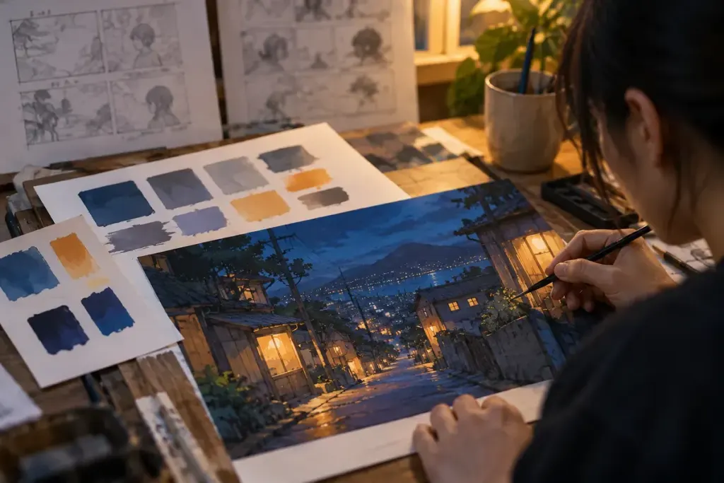
For a viewing notebook, draw three small colour patches and describe their jobs: background atmosphere, readable figure, point of attention. Add one sentence about the action they support. This keeps your analysis tied to the scene, instead of becoming a list of universal colour meanings that the next episode will immediately contradict.