
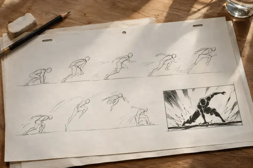
A punch connects, a foot hits the ground or a machine crashes through a barrier. For an instant, the normal picture may disappear into a stark silhouette, a reversed colour scheme or an almost abstract burst. At normal playback speed, that interruption can register as force rather than as a separate illustration.
These brief visual accents are commonly called impact frames. The useful question is not how many extra details they contain, but what they make the viewer feel at the exact point of contact.
Contrast becomes part of the timing
Blender Studio’s production account Fighting with Grease Pencil describes adding frames with opposing colours and patterns to give action more punch. It is a creator’s explanation of a technique, rather than a claim about how every anime studio works.
Consider an imagined scene with a grey background and a blue character. A single dark silhouette against a pale field can momentarily simplify the whole image. Returning to the ordinary colours makes the interruption feel sharp. The surrounding frames establish the action; the accent concentrates attention on its decisive instant.
This differs from a smear that stretches a moving form between positions. Both can look strange when paused, but an impact frame may be about contrast and punctuation rather than representing the object’s path through space.
Read the frames around the accent
When studying a sequence, first watch it normally. Then examine the anticipation, the contact and the recovery as a group. A striking still image can seem arbitrary when removed from those neighbours, just as a punctuation mark says little without its sentence.
Blender Studio’s Cowboi production notes discuss silhouettes, inverted contrast and abstract energy shapes. They offer another practical example of reducing literal detail to direct attention.
For your own storyboard exercise, draw the same action twice: once with consistent rendering throughout, and once with a deliberately simplified contact frame. Keep the action itself unchanged. Compare what becomes easier to read and whether the accent belongs to the scene’s mood. More contrast is not automatically better; a quiet comic stumble may need a different punctuation from a climactic collision. The interesting craft lies in choosing the moment, not applying a visual effect to every movement.