
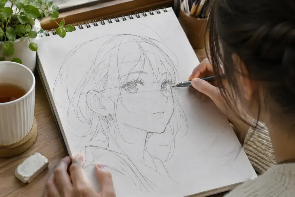
A character turns their head, yet both eyes remain drawn as if the face were looking straight ahead. The result can feel unsettled even when each eye is attractive on its own. The issue is often their relationship to the head’s turn.
Three-quarter view sits between a front view and a profile. The far side of the face is seen at a different angle, so copying and sliding one identical eye across the page rarely produces a convincing result.
Try a three-step construction exercise
- Draw a simple head volume and a centre line curving over it. Establish the turn before adding lashes, pupils or hair.
- Mark an eye line that follows the same volume. Place the eyes in relation to that guide and the nose, rather than spacing them as two unrelated symbols.
- Check the far eye’s visible width and its relationship to the bridge of the nose. Adjust the construction before committing to detailed linework.
CLIP STUDIO’s drawing guidance on angled faces provides an illustrated reference for studying the change in view. Its examples are a learning aid, not a universal set of proportions for every manga style.
Repeat the exercise with the same character looking slightly left and slightly right. Keep the character’s key design features consistent while allowing perspective to change their appearance. You are testing whether the face turns, rather than whether both eyes occupy equal space on the page.
When something looks wrong, temporarily hide the hair and decorative details. Compare the centre line, nose placement and eye line first. Correcting those relationships may solve a problem that additional shading only conceals.
Stylisation can deliberately exaggerate or flatten the face. The useful distinction is whether you chose that effect or arrived there accidentally. A clear construction gives you something to simplify, stretch or break with intention when the scene calls for it.